A Palette Taken from the Pavement: Colour Stories Found on British Streets
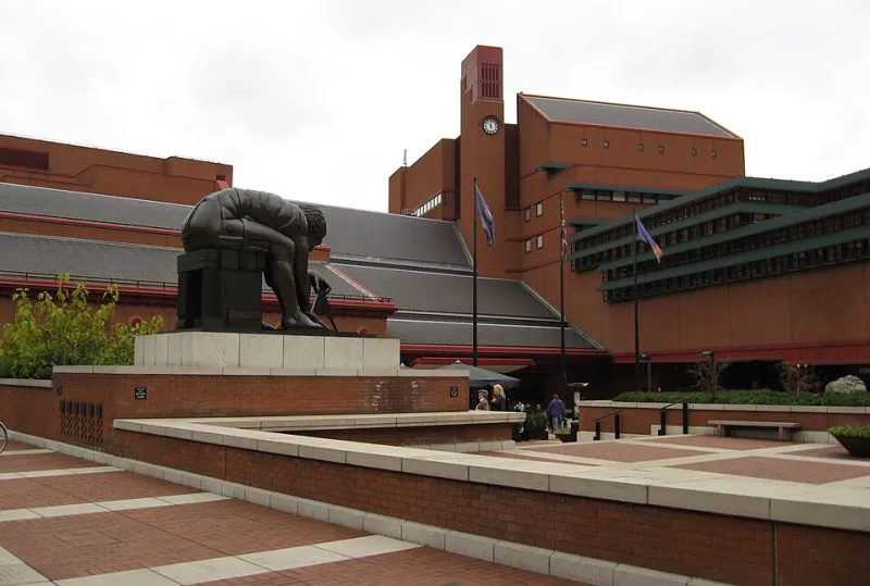
Photo: Jack1956, Public domain, via Wikimedia Commons
Colour forecasting has an odd relationship with the physical world. A season's palette is presented as a set of chips, usually named after something evocative, and the chips are then translated into cloth by people who must make them work as garments. Somewhere in that translation, the reason for the colours is lost. What remains is a range of tones that must be paired by guesswork.
Building a palette from a place is a corrective to this, and a fairly old-fashioned one. It begins with surfaces that already sit beside one another in the world, in weather, under a northern sky, and it accepts the constraint that whatever results must be worn by people going about ordinary business.
Why a Place Beats a Mood Board
A place supplies its own rules. London brick does not occur next to coastal lichen often, and when it does, the lichen is on the stone rather than the brick. This matters more than it sounds. A palette drawn from a single location carries an internal logic — of soot, damp, weathering and paint — that a collection of reference images rarely possesses. The colours have already agreed with each other about saturation, temperature and how much dirt they can absorb before looking neglected.
The discipline is in the limitation. A street gives perhaps six usable tones and a great many unusable ones, and learning which is which is the whole exercise.
Five Surfaces, and What They Actually Are
Brick. Not red. The common London stock is a muted orange-brown, dulled by soot and lime mortar, closer to a burnt sienna with grey in it than to anything found on a colour wheel. Translated into cloth it behaves best as a flannel or a brushed wool, in a mid-tone that sits darker than terracotta and considerably softer.
Lichen. Coastal stone carries a grey-green, pale and slightly sulphurous, which is far harder to wear than its popularity suggests. It is a difficult tone in quantity and an excellent one in small measure — a thread, a lining, a scarf. In cloth, a wool-silk in a soft sage reads well; a full garment in the yellowed version does not.
Wet slate. The difference between slate and charcoal is sheen. Wet slate is a blue-black with a polish to it, which argues for a cloth with some lustre — a waxed cotton, a fine gabardine, a wool with a dry hand but a faint gleam. Flat charcoal completely misses the point.
Painted doors. The British tradition of painting joinery in considered colours — dull greens, oxblood, chalky off-whites, a particular inky blue — is a ready-made trim palette. The caution is that these colours are mixed to be seen in large flat panels in daylight, and a garment is neither flat nor a panel. Use them for detail.
Weathered stone. Portland, Bath, and the grey-brown vernacular of the north all give a chalk-to-bone range of warm neutrals, and this is where most of a wardrobe should live. Warm greys and chalk whites are the connective tissue of any palette built this way; they are what makes the stronger colours tolerable.
Assembling It
Once the surfaces have been photographed and reduced — and they should be reduced, ruthlessly, to no more than six tones — the useful next step is to assign roles rather than to arrange a grid.
A palette needs a base, which will occupy roughly half of any outfit; a mid-tone, which will occupy a third; and one accent, which should be no more than a tenth. In a street palette derived from the surfaces above, the base writes itself: stone chalk, warm grey, bone. The mid-tone is the brick or the slate, and there is no need to use both. The accent is the lichen, or the painted-door oxblood, or the inky blue — one of them, not three.
Theatricality almost always comes from proportion rather than from colour choice. Three strong tones in equal measure will look like costume regardless of how tasteful each one is; one strong tone against a great deal of chalk will look considered. This is the argument for restraint, and it is practical rather than moral.
The Dye Lot Problem
A palette that exists on paper will not survive contact with a mill's dyeing schedule. Two cloths from different mills, nominally the same tone, will not match; two cloths from the same mill in different lots may not match either. There are two sensible responses.
First, do not attempt to match across qualities. Pair by weight and texture and allow the colour to differ slightly. A chalk linen beside a bone wool reads as intentional; a chalk linen beside a bone wool that is almost but not quite the same reads as a mistake.
Second, test the lot before committing. Ask for a stock cutting from the actual batch, not a reference swatch, and view it beside the other cloths in the palette in daylight rather than under the studio lamp. Where a match matters — a jacket and trouser cut from the same cloth — buy both lengths from one lot and record the number.
Trim is easier to control than cloth and should be used to steady a palette that is drifting. Horn and corrugated horn for warm tones, corozo for cooler ones, cotton tape in a neutral, thread matched to the mid-tone rather than the base. Small decisions, but they are what stop a group of fabrics from looking like an accident.
Keeping It Wearable
The test of any palette built this way is not whether it photographs well but whether it can produce, without effort, the outfit someone puts on at half past seven on a wet Tuesday. If the answer requires a decision, the palette is too complicated.
A useful filter is to remove the accent entirely and check that the remaining tones still form a wardrobe. If they do, the accent is decoration and can be enjoyed as such. If they do not, the palette is being held together by its loudest element, which is a fragile arrangement.
The streets are not a mood board and should not be treated as one. They are a record of what weather, soot, lime and paint have already agreed upon over a long period — a more patient exercise in colour than any season's forecast, and considerably more useful to anyone who has to make cloth out of it.